Last updated on June 13th, 2023
A story about our rebranding, logo design, and how we established a strong branding.
With advertising on social media platforms and search engines already reaching saturation levels, it’s getting harder to get those crispy pageviews thriving up on your website.
As a result, many organisations and successful startups are betting their money on content marketing — and they are winning. Content marketing will see immense growth in the coming years as companies look to provide quality content for their visitors and customers.
As of now, you can easily notice that almost all startups, big or small, have at least one blog talking about their internal company culture and problem-solving within their niche. This is a good practice and it seems to be working. The number one content marketing goal for B2C businesses in 2016 is sales (83%), followed by customer retention and loyalty (81%), and engagement (81%) (source).
The result of this ten-fold growth in content marketing is the increasing need for good writers and editors to deliver that content. But popular freelancing platforms these days do not ensure quality, and as a result, marketers feel dissatisfied with their investment.
With 50% of B2C companies planning to increase their content marketing budget in upcoming years (source), quality content is the need of the hour. It is the gear which drives content marketing.
We at WittyPen have implemented a state-of-the-art operations workflow which yields top-notch content for our clients. Until now, this workflow was relying entirely on Google Apps like Sheets and Docs. All the coordination and interaction between the customers and the writers happened via emails and phone calls, which required a higher level of human involvement.
We decided to automate much of this operations workflow by building an in-house tech platform that takes care of all the heavy lifting involved with content creation.
In October last year, I met the founder of WittyPen, Anshul, who was looking for a team to bring this project to reality. He explained the entire scenario to me; I loved the idea behind it and decided to be part of this journey. With 20+ paying, long-term customers, it was important to build the platform as soon as possible. This was a big problem to solve, with much of the stuff waiting to be implemented for the very first time.
We laid down all the requirements from the perspective of clients, writers, editors, and moderators. Our focus was to make the content ordering system as hassle-free as possible. Within a month and a half, we (the engineering team) delivered the core product with all the basics covered.
Yet, it felt like something crucial was missing. There was a pressing need for strong branding and brand positioning. Rather than coming up as a services company, WittyPen now needed to portray itself as a product-based company. And product-based companies require strong branding right from the start.
“Your brand is your promise.” — Dana DiTomaso, MozCon 2015
Consistent branding is crucial and involves a lot of intricate moving parts, which later become the decisive factors for the company’s overall brand appeal. We tried and tested several iterations. At first, we experimented with the existing logo and colours, and then decided to go with a flat design approach for the website. However, we soon realised that a fresh branding solution was needed to appeal to more customers.
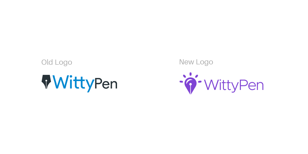
First up to be revamped was the logo. I took a day off to draw inspiration from various sources, do research, and come up with a new design. After exploring a number of variations, I zeroed in on a design that I knew would work out well in the long-term. I chose to improve upon the old logo — the essence of which is the nib of a pen — to match our current brand identity. Thus, the new face of WittyPen was born.
Looking back, it was a wise decision not to scrap the existing logo for a brand new, alien concept. It would have ruined our existing brand recognition in the market. The new logo is well-liked since there are no conflicting ideas behind it and also because it is an apt representation of Witty and Pen.
The next thing to do was creating a new logotype, which is what I consider to be the most demanding part of the logo design process. Picking an appropriate font for a logotype is not a simple task. I tested over 20 fonts but none of them had what I was looking for.
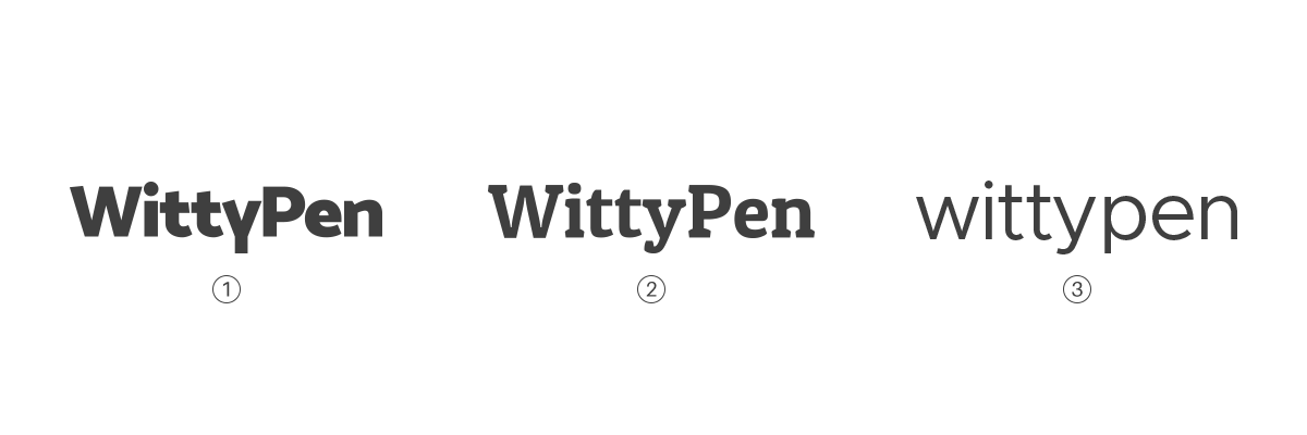
I gave it another day and started over with a fresh mind. I finally arrived at a logotype I was happy with.
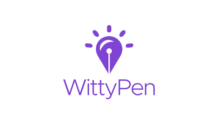
After testing it across multiple use cases, I found this one to be the best solution. For the sake of comparison, here’s the old and new logo, side by side:
Next up was devising a uniform colour palette, which I felt wouldn’t be much of a difficult task, given how the existing yellow-blue-black palette had had a good one year run. I almost decided to follow it for the time being, but there was this feeling that something wasn’t quite adding up. Anshul noticed it as well and it was then clear to us that there’s room for more innovation.
“Creativity can’t thrive under boundaries.”
We realised that sticking to the old colour palette was holding us back, so we dumped it altogether. After researching human response to colours, I went with purple as our principal colour. It is known to be a colour of trust, quality, and most importantly, authenticity. Since we at WittyPen deliver content that is freshly brewed to cater to each customer’s needs, purple fit right into the equation.
Next, I chose a shade of aqua blue as the accent colour. This is highly experimental, as most people will argue that it doesn’t go well with the purple we’re using. But skimming through Dribbble’s illustrations, I found that this particular shade of blue is closely associated with all things related to writing.
So I went ahead with it anyway. Again, I know it’s experimental, but I’m excited to see how it blends with purple in our future illustrations and graphics.

The final color palette
Closing Note
The new WittyPen is more consistent with its branding and our team is working hard to make the content creation process a breeze. We are also building a robust next-gen platform that will let our customers get the content they like within a matter of days. We are excited for the year ahead and hope that we bring the best of content creation back to the community powered by a tech platform that is beautiful yet powerful.
Here’s to the upcoming year. We feel it coming!


